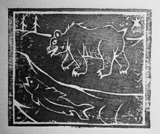
The Bingorage template got an overhaul, last night; in conjunction with the blossoming of the Bingorage Fort Frances Portal. Please let me know what you think of the changes, if you've been here, before. If you are a new visitor, definitely let me know what you think. Take a stroll around. Bear & Salmon Woodcut print<<<<<<< MPLS, '99?
The image in the new background is an old Logo sketch for Broken Vulture Art that's been kicking around for 6+years. The banner at the top of the page is a distorted view of the Bingorage office.
Tags:
bingorage,
blog,
woodcut print,
native art,
Fort Frances


1 comment:
Well dude, I really like the incorporation of your artistry with the blog design, but the original design was easier on the eyes to read (with the contrast of dark letters on light background). The white text I can read ok, but the teal and the amber colors are more difficult (although not impossible). Could you modify those two? I think that they are the weblinks and the post headings, respectively.
Post a Comment